Timothy Cody

Data Scientist with a Master's in Analytics and 3 years in experince delevering analytical reporting and data driven insights.
Skills: Python, R, SQL, Power BI, Tableau
View My LinkedIn Profile
Global Temperature Prediction and Visualization
Project description: Global temperature prediction project and visualization complete with D3
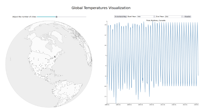
Details: Our team has successfully built an interface to visualize and predict surface temperatures in various cities over the course of the last 100 years and a couple of decades into the future. The interface serves as a resource for the general population to interact with, providing readily available information on climate change and its effects on surface temperature, which was previously only accessible through technical tools that assumed prior understanding of the topic. With this interface, we aim to increase awareness of the issue, and provide a reference point for areas to focus on and policy changes to make. Through this finished project, we hope to contribute to the fight against climate change by making vital information easily accessible and understandable to the general population.
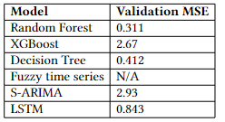
A number of different models were tested before final selection. We selected the Random Forest model as our final method for predicting temperature changes due to its superior performance, as demonstrated by the lowest Mean Squared Error (MSE) among the models tested. Despite its accuracy, however, building the Random Forest model proved to be a computationally-intensive process, requiring significant processing time to complete. To mitigate this challenge, we chose to perform all of our temperature predictions offline, before loading the results into CSV files for display in our visual interface.
Our finished tool is designed to provide users with a visually-engaging and informative experience that highlights the impacts of climate change in different regions and cities. The interface is built using d3.js, a powerful JavaScript library for data visualization that enables us to create interactive and dynamic charts and graphs. In addition to the map, our interface also features several other interactive elements that allow users to explore temperature changes in more detail. A line chart displays the temperature changes over time for the selected city. Users can also access detailed information about specific cities, including historical temperature data and projections for the future. Overall, our interface is designed to be both accessible and informative, allowing users to gain a deeper understanding of the effects of climate change on different regions and cities.